
How to create diagonal columns using css3
In this article we will go through a step by step plan to create diagonal columns using css3.
Let’s start having a look at the markup: we have three columns (.col) floating to the right, inside a .container div.
<div class="container clearfix">


<a class="col colRight" href="http://www.trainingdragon.co.uk" target="_blank">

<div class="colInner"></div><!--/colInner-->

</a><!--/colRight-->


<a class="col colCentre" href="http://www.trainingdragon.co.uk" target="_blank">

<div class="colInner"></div><!--/colInner-->

</a><!--/colCentre-->


<a class="col colLeft" href="http://www.trainingdragon.co.uk" target="_blank">

<div class="colInner"></div><!--/colInner-->

</a><!--/colLeft-->


</div><!--/container-->
Each columns contains a .colInner div that holds a picture and some text:
<a class="col colLeft" href="http://www.trainingdragon.co.uk" target="_blank">
    <div class="colInner">
        <span class="bg img1"></span>
        <div class="colText">
            <div class="colTitle">lorem ipsum</div>
            <div class="colSubTitle">Vivamus id purus mauris</div>
        </div>
    </div><!--/colInner-->
</a><!--/colLeft-->
You can see the starting point in Figure 1 and download a zip folder here. (add link to download zip folder)
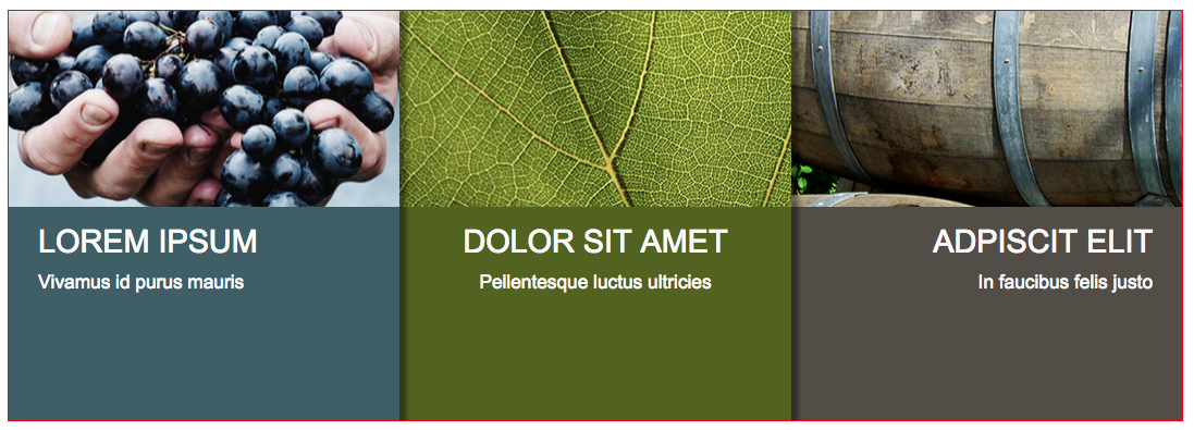
Figure 1 three floated columns with images and text
Please spend some time reading the css for columns and images, it’s worth noticing:
- images and columns are bigger than their respective containers
- hidden overflow for container and columns
- images are set as background images, not omg tags
Read Css for container, columns and images below:
.container{
    margin:100px auto;
    width: 80%;
    max-width: 1200px;
    border:1px solid red;
    height: 420px;
    overflow: hidden;
}

.col{
    float:right;
    width: 33.333333%;
    height: 600px;
    color:#F9F9F9;
    box-shadow:  8px 0px 5px rgba(0,0,0,0.4);
    overflow:hidden;
    display: block;
    text-decoration: none;
}

.bg{
    display:block;
    background-size: cover;
    background-repeat: no-repeat;
    background-position: 50% 50%;
    width: 150%;
    height: 200px;
    margin:0px 0px 0px -20%;
}
.img1{background-image: url("../imgs/pic_01.jpg");}
.img2{background-image: url("../imgs/pic_02.jpg");}
.img3{background-image: url("../imgs/pic_03.jpg");}
STEP:
rotate columns inner content using css transforms (figure 2)
.colInner{
transform:rotate(-10deg);
}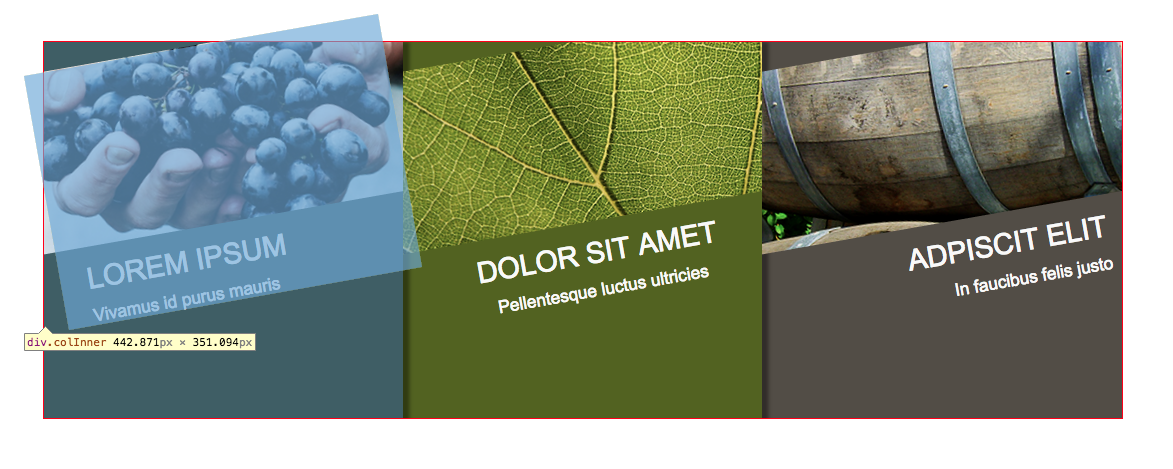 Figure 2: the content of the three columns is rotating 10 degrees counterclockwise.
STEP3: counterrotate columns (figure 3)
.col {
transform: rotate(10deg);
}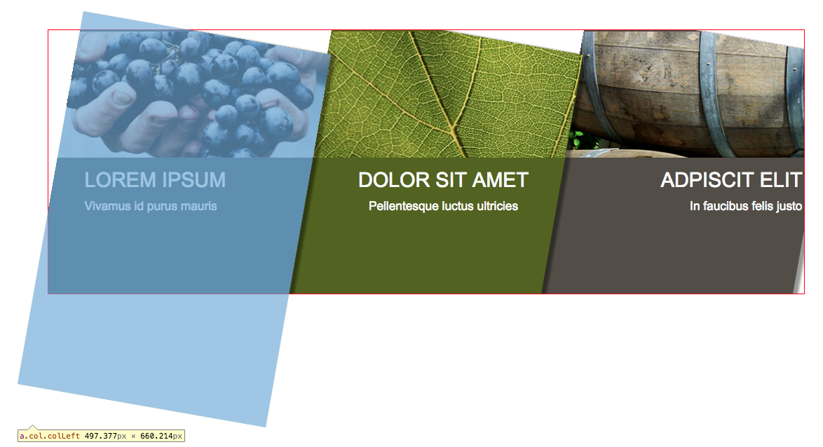 Figure 3: the three columns are rotating 10 degrees clockwise.
Very good, we have diagonal columns and their content is horizontally aligned, but we have a lot of white in the background, and images and text are still to be fixed.
STEP4: add a background gradient to the container, using background colours of columns at the two extremities (figures 4 and 5).
.container{
    background: linear-gradient(to right, #405e66 0%,#405e66 50%,#524d45 50%,#524d45 100%);
}
Figure 4: using a gradient background to cover behind columns, using colours of columns at the extremities.
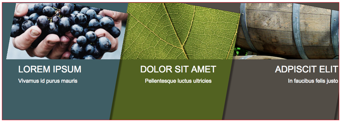
Figure 5: columns and background colours.
STEP5: using margins, we push columns up and their content down (figure 6).
.col {
    margin-top:-100px;
}
.colInner{
    margin-top: 150px;
}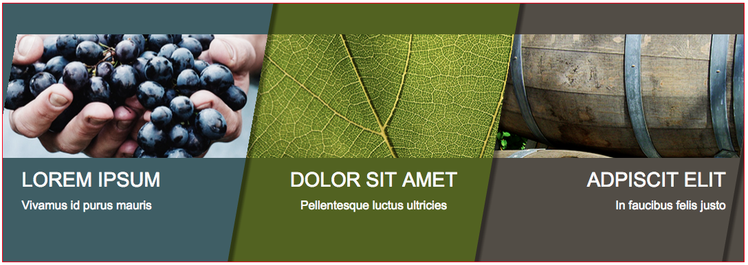
Figure 6: columns and content after applying vertical margins.
STEP 6: Last two steps will be mainly adjusting small details to align content, remove box-shadow from column on the right (figure 7),
then adjust positioning of left column (figure 8).
.colLeft .colText{padding-left:15%;}
.col.colRight{box-shadow: none;position: relative;left:7px;}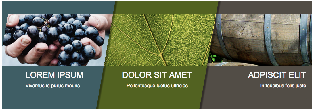
Figure 7: adjusting left and right columns.
.container {
    /*...*/
    overflow: hidden;
    position: relative;
}
.colLeft{
    position:absolute;left:-7%;width: 40%;
}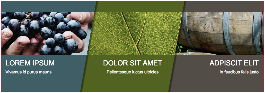
Figure 8: final result.